In our last blog post, I introduced you to the addition of expense categories and showed you how easy it was now to assign a category to an expense in Tricount. I have also shown you how it is possible to know the total expenditure by category, by activating the new sorting option (by category):

Finally, I validated with you that we can use the export feature to push the analysis further in Excel / Google Spreadsheet if we want.
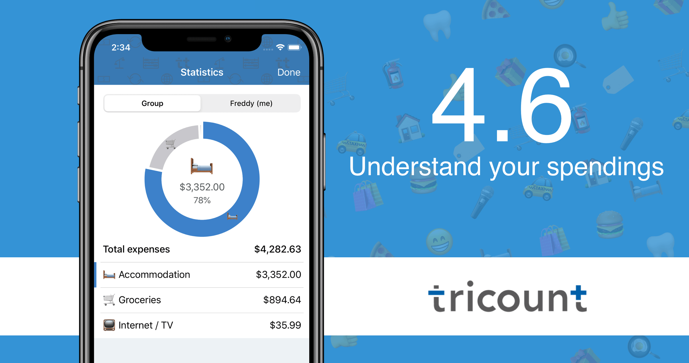
Chart in the app
The new version of Tricount (4.6) extends the categories by offering a pie chart right in the app.
You can access it from the tricount menu, as shown in the image below:

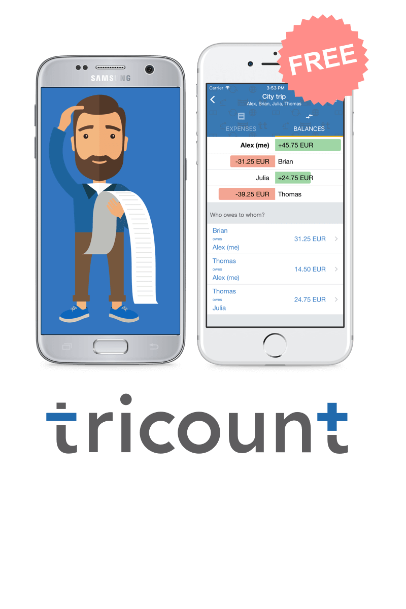
To make sure you understand the screen on the right, I used the (mock) example of a group of 4 friends who use Tricount to manage their flatmate’s expenses.
In this group, Freddy organizes the payment of rents and charges centrally, while his friends pay him back their shares on a monthly basis. The group uses the app to balance all their common expenses: rent, shopping, internet, etc…

Analyze your expenses
Most people use Tricount because the app allows them to have fair finances. At any time, you can:
- get an accurate overview of who owes money / has to be reimbursed, and why
- see the easiest way to balance the account
With the expense categories introduced in version 4.5 and now the addition of this “pie chart” in version 4.6, Tricount goes further and now allows you to understand your spendings.
In the example above, we can see that accommodation makes up the biggest part of the roommate’s “cost” (78%), while shopping comes in second place.
In addition to group statistics, Tricount offers personal statistics. As I identified myself as “Freddy” in the accounts, you can see below that the groceries represent 22% of the roommate cost for Freddy.

We are interested in your opinion!
We want to filter those stats…
For example, we think it would be useful to define the time range covered by the chart: indeed, if the tricount is spread over several months, you could be interested in the stats over a given period of one month for example.
The objective is to offer a practical tool to better control and act on one’s budget, to know if efforts are paying off, to visualize the evolution of one’s expenses…
In this context, we are interested to have your opinion (leave a comment below or in a mail to support@tricount.com)! Do you have any ideas? Share them with us!