With the launch of iOS 13, Apple introduced a dark system-wide appearance called Dark Mode. All default apps can use a darker color palette if the user decides to enable it. This gives us the opportunity to offer a fresh look for a familiar interface.
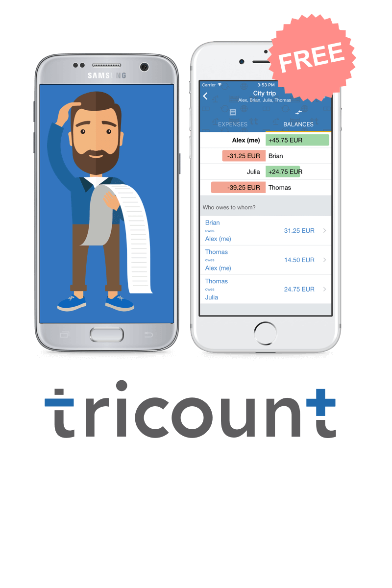
At Tricount, we want to make sure that you can easily split your expenses with all your friends with a great experience. We don’t want to burn your eyes when opening our app when you are used to the Dark Mode.
The research in terms of usability is pretty clear: There is no measurable improvement for the app performance when using it in the Dark Mode. According to Nielsen Norman Group:
[…] in users with normal vision, light mode leads to better performance most of the time.
However, many users react positively when presented with the Dark Mode version of the app. According to them, it makes the screen easier to look at in low-light environments, for example at night or in the early morning.
It can also save battery life, but only if used long enough.
Why should you support Dark Mode?
Designing for the Dark Mode takes some time, but it’s definitely worth the effort. You will review all app components including rare error messages, dialogs, web views and menus. Besides that, Dark Mode no longer seems to be an IDE setting for programmers but is accessible for many users now.

A good starting point is the reference of the material design guidelines.
Inverting colors is not enough
Unfortunately it’s not enough to change the background color from light to dark and to edit the color of dark fonts to white fonts. All colors that we used so far needed refinement for the Dark Mode. Advice: Make sure your colors are defined in one central file first. Avoid pure black as a background color and pure white as a font color.
It’s all about contrast
The guidelines are also very clear regarding contrast. You want to make sure that all elements are readable, regardless of the mode. A great tool for determining the contrast of a foreground against a background color is the contrast checker from webAIM: Aim for a contrast of at least 4,5 : 1.
Color alignment
You might have noticed that our primary color changes slightly in Dark Mode. Our current primary color is too saturated for the Dark Mode, which can cause eye stain according to the Material Design guidelines. That’s why we decided to go for a slightly desaturated primary color. Most of the icons won’t change themselves. Make sure to use the correct color in all your assets. When applying the guidelines for the fonts, we end up using 5 different colors.
In case you are using web views for some contents, make sure to respect the setting of the user. There are CSS rules for detecting the Dark Mode.
Every new feature that will be designed, from now on needs to be designed for the Dark Mode as well.
Did you notice? Our splash screen in Dark Mode is still the one of the light mode. Is that a problem for you? Let us know.
Development
In terms of code, our development team relied on the new APIs introduced by iOS 13. If you are running an older OS version we strongly recommend you to update your phone and give Dark Mode a try.
As mentioned before, implementing Dark Mode is not just about inverting colours. Each screen has its own constraints, a colour can easily be replaced by a darker one in a given component but would need to stay the same in another. Every UI module still needs to stay coherent and provide a good user experience.
Also, not all screens were created equal, some were made with Storyboards and Xib files while others were created 100% programmatically. While each approach has pros and cons, we had to find a solution that worked everywhere. We decided to abstract our colour, instead of calling them “blue”, “black” or “white”, we named them “background”, “header title” or “primary button”. Using this approach, we centralised all our colours in one place, added this layer of abstraction on top and added a runtime logic that picked the “real” colour to use depending if Dark Mode is activated or not. This centralised logic can then be called anywhere in our code, which makes it very easy to work with.